bustaheims
Well-known member
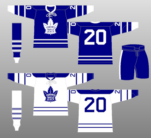
White jersey still looks . . . not right.
Follow along with the video below to see how to install our site as a web app on your home screen.
Note: This feature may not be available in some browsers.
Dappleganger said:bustaheims said:White jersey still looks . . . not right.
Agreed.
herman said:Dappleganger said:bustaheims said:White jersey still looks . . . not right.
Agreed.
Mayhaps it won't look so incomplete when they put on the gloves and pants.
herman said:Dappleganger said:bustaheims said:White jersey still looks . . . not right.
Agreed.
Mayhaps it won't look so incomplete when they put on the gloves and pants.

hockeyfan1 said:Nice logo, 'bland' jersey. Certainly they can do better.
The no patches /crest on the shoulders; single stripe at waist. This is what needs reworking.
Prefer instead double stripes & a nice crest on the shoulders. The crests / patches on shoulders not a true necessity, but it'd give it a crisper, more distinctive look.
Chris Creamer @sportslogosnet
No shoulder patches for the #Leafs worked fine with this similar design in 1991-92

CarltonTheBear said:After sleeping on it I've actually changed my tune on these. They're not the absolute perfect jersey but I like them. Maybe it's just because of how much I love that logo design. I think even once we see numbers on the sleeves it'll make it look a little more complete.
bustaheims said:White jersey still looks . . . not right.

CarltonTheBear said:After sleeping on it I've actually changed my tune on these. They're not the absolute perfect jersey but I like them. Maybe it's just because of how much I love that logo design. I think even once we see numbers on the sleeves it'll make it look a little more complete.
CarltonTheBear said:If the new white one had the blue on the shoulders like those did I'd have been extremely happy.
hockeyfan1 said:Nice logo, 'bland' jersey. Certainly they can do better.
The no patches /crest on the shoulders; single stripe at waist. This is what needs reworking.
Prefer instead double stripes & a nice crest on the shoulders. The crests / patches on shoulders not a true necessity, but it'd give it a crisper, more distinctive look.
Chris Creamer @sportslogosnet
No shoulder patches for the #Leafs worked fine with this similar design in 1991-92

bustaheims said:CarltonTheBear said:After sleeping on it I've actually changed my tune on these. They're not the absolute perfect jersey but I like them. Maybe it's just because of how much I love that logo design. I think even once we see numbers on the sleeves it'll make it look a little more complete.
I'll wait until I actually see them on players in action with all the addition patches, etc., that are going to be there. I can see the white one looking a lot better as part of the full uniform, for instance. What I'm really looking forward to are some of the throwback one-off jerseys we'll likely see this season. I really hope they rock the St Pats jersey again.
L K said:I like the St. Pat's jersey. I could do without the brown pants.

