• For users coming over from tmlfans.ca your username will remain the same but you will need to use the password reset feature (check your spam folder) on the login page in order to set your password. If you encounter issues, email Rick couchmanrick@gmail.com

New Logo and Uniform potentially in 2016/17

Status
Not open for further replies.

CarltonTheBear

Administrator
Staff member
http://news.sportslogos.net/2015/12/13/maple-leafs-will-get-new-logo-new-uniforms-in-2016/

http://www.pensionplanpuppets.com/2015/12/13/10022406/report-leafs-about-to-get-entirely-new-logo-and-uniforms

Well, the timing certainly makes sense since it'll be our centennial season. It's always a little worrying when something like this comes up, but they can't possibly be a completely trainwreck, right? I'd be glad if they went back to the more vintage Leafs logo or something like that.
 
There's really only so much you can do to mess up the Leafs jerseys. Especially if, and I'm guessing here, that doing it this year implies they'll be throwbacks rather than attempting to go futuristic.
 
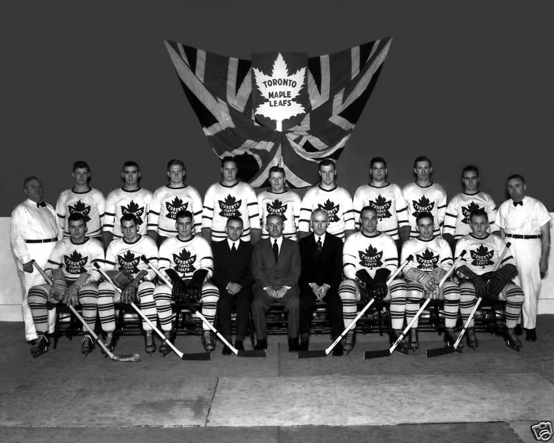
Although there's no better uniform than the 1933-67 logo, I wouldn't be against bringing back the original logo and jersey.

latest


Although that leaf in the flag looks kind of disfigured...
 
I think the vintage logos are horrendous.

The '67 logo has absolutely terrible kerning on the letters and the use of a lower case 'n' and 'm' is strange. The angles on the sides of the two side portions of the leaf are awkward when paired with the angles on the bottom. Let's not even talk about the ones from prior to '38. They make my eyes bleed.

The current logo is quite good, especially with the improvements made in the '80s.

The article makes a good point about removing the wordmark from the logo so it's more useful at smaller sizes.

I hope they don't screw this up and make a fugly logo just to appeal to tradition.
 
Potvin29 said:
I always liked that third jersey they used a number of years back that was a vintage logo.

This one?

29600.jpg


That was always my favourite, and also happens to be the last jersey I bought (Darcy Tucker/16).

I fully intend on getting a Nylander jersey once he makes the team/picks a number, so I'll probably be getting the new jersey if it's nice.
 
CarltonTheBear said:
Potvin29 said:
I always liked that third jersey they used a number of years back that was a vintage logo.

This one?

29600.jpg


That was always my favourite, and also happens to be the last jersey I bought (Darcy Tucker/16).

I fully intend on getting a Nylander jersey once he makes the team/picks a number, so I'll probably be getting the new jersey if it's nice.

That's the one.  Those are great.
 
Bender said:
Although there's no better uniform than the 1933-67 logo, I wouldn't be against bringing back the original logo and jersey.

Sportslogos.net has them with this one from 38-63:

5qxts4g5ygd6rufh0k4ftx8rm.gif


And this one from 64-67:

201.gif


And then this from 67 to 70:

fg1lx64zz806v9yqg32x559ec.gif


Anyways, this is what they have as the history of it:

http://www.sportslogos.net/logos/list_by_team/28/Toronto_Maple_Leafs/

Honestly, looking it over, I wouldn't be terrified if they tried out something new-ish.
 
Bullfrog said:
I think the vintage logos are horrendous.

The '67 logo has absolutely terrible kerning on the letters and the use of a lower case 'n' and 'm' is strange. The angles on the sides of the two side portions of the leaf are awkward when paired with the angles on the bottom. Let's not even talk about the ones from prior to '38. They make my eyes bleed.

The current logo is quite good, especially with the improvements made in the '80s.

The article makes a good point about removing the wordmark from the logo so it's more useful at smaller sizes.

I hope they don't screw this up and make a fugly logo just to appeal to tradition.

I gotta say I disagree with you completely about the 67 logo. I like the n and m treatment and there is no kerning going on at all with the all caps. Its letterspacing is it not?  And the wider spread on Toronto works with the tighter rest of the name.

I do agree with you on the early ones. Godawful.
 
Seems like I'm in the minority, but I absolutely hate the logo from 67 to 70.  Doesn't look like a professional team's logo at all to me.

They better not do something stupid like when they added silver to the jerseys.
 
Zanzibar Buck-Buck McFate said:
I gotta say I disagree with you completely about the 67 logo. I like the n and m treatment and there is no kerning going on at all with the all caps. Its letterspacing is it not?  And the wider spread on Toronto works with the tighter rest of the name.

I do agree with you on the early ones. Godawful.

There's a subtle difference, but letterspacing between all letters is calling tracking. Letterspacing between specific pairs of letters is called kerning. Because of the different shapes of letters (and the optical effects they have) certain pairs of letters should have different spacing. We'll just have to disagree, but the lowercase m and n are just strange What's the meaning behind that? If those are actually supposed to be uppercase, then that's just a terrible typeface.

The typography on '67 logo is atrocious. The spacing between the "T O" and "O T" is almost twice that of the "O R". The spacing between all letters in Toronto is inconsistent.

The other thing that bothers me is the angle of the sides of the leaf blades. I can't quite place it, but the "pointiness" of the whole thing bothers me.

The '67 logo could be probably be improved without totally destroying it. But I'd be interested in a new logo that bases itself off of the current one, which I truly believe is excellent.
 
Peter D. said:
Seems like I'm in the minority, but I absolutely hate the logo from 67 to 70.  Doesn't look like a professional team's logo at all to me.

They better not do something stupid like when they added silver to the jerseys.

By 67 logo you mean this:

fg1lx64zz806v9yqg32x559ec.gif


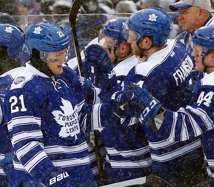
I don't really like that one either. Again, the 64-67 logo is the best. Although I don't mind the ones that came before it either. I thought the Leafs did a good job with the Winter Classic jerseys that used the more original logo:

TorontoMapleLeafsWinterClassic2014.jpg
 
The wordmark from '38 to '67 bugs me too. 'Toronto' is not quite centered. Are we the only 'Original 6' team with words on our logo?

I expect we'll be going with a flat logo without the wordmark in a leaf reminiscent of the pre-'38 Leaf, a la the Winter Classic 2014, but with more subdued banding at the elbows and hips (Adidas tri-stripe) so we don't look like a prison team. I dig the current laced collar too.
 
Bullfrog said:
I think the vintage logos are horrendous.

The '67 logo has absolutely terrible kerning on the letters and the use of a lower case 'n' and 'm' is strange. The angles on the sides of the two side portions of the leaf are awkward when paired with the angles on the bottom. Let's not even talk about the ones from prior to '38. They make my eyes bleed.

The current logo is quite good, especially with the improvements made in the '80s.

The article makes a good point about removing the wordmark from the logo so it's more useful at smaller sizes.

I hope they don't screw this up and make a fugly logo just to appeal to tradition.

Someone's a graphic design nerd!

I agree with you, though. That logo is an amateur hour disaster. The logo that immediately proceeded it is my favourite, though. It would just need some slight tweaking - like centering the text properly and improving on the tracking - and I'd be happy to see that as the new logo. I also did really like what they did for the Winter Classic, but only as a 3rd jersey. If that was the full time logo, it would need some significant refinements.

Not sure I can agree with you about the current logo. To me, it feels stale.
 
Status
Not open for further replies.

About Us

This website is NOT associated with the Toronto Maple Leafs or the NHL.


It is operated by Rick Couchman and Jeff Lewis.
Back
Top